Printing landscape on architectural paper
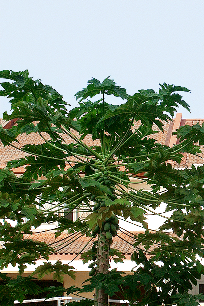
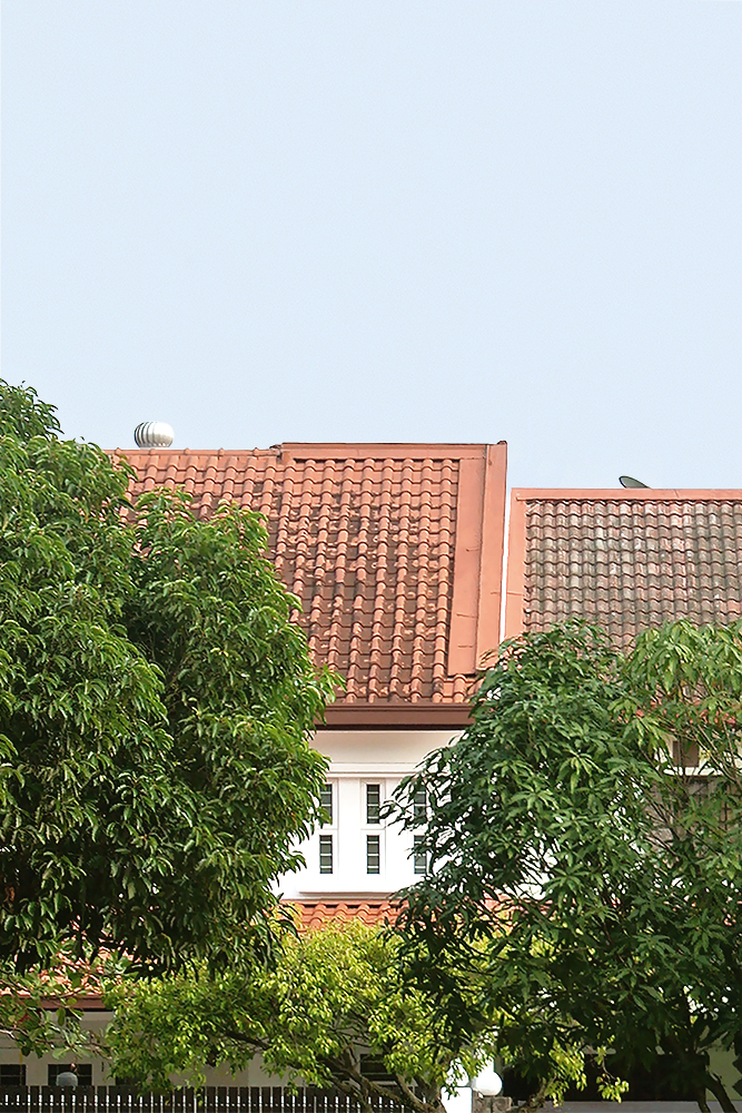
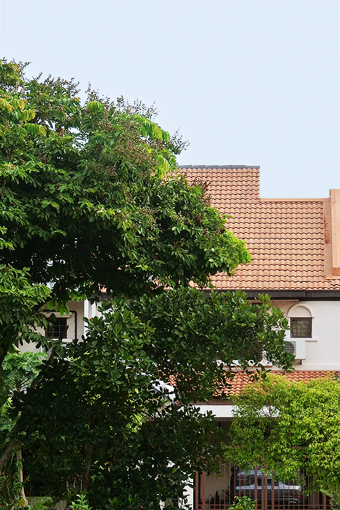
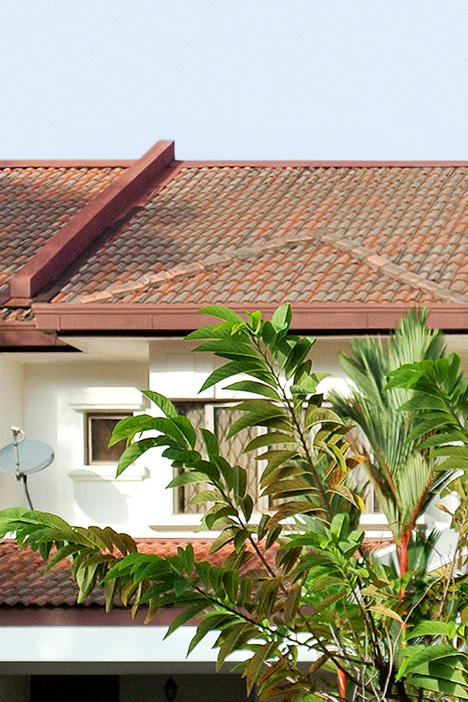
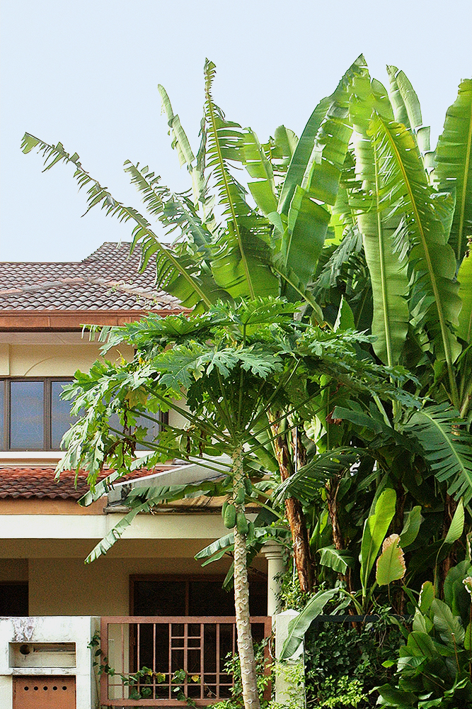
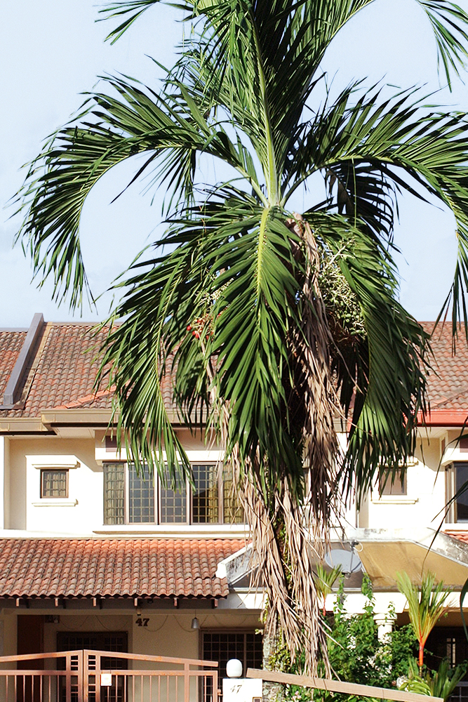
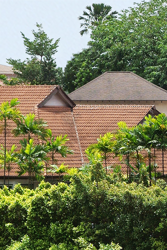
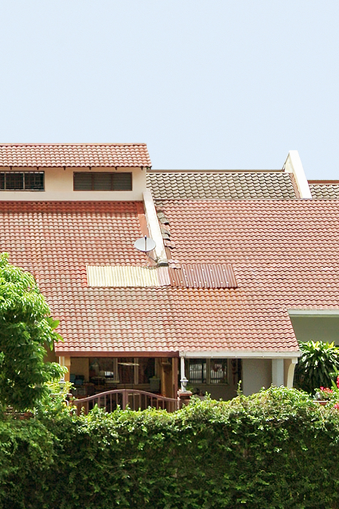
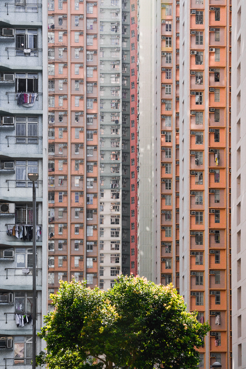
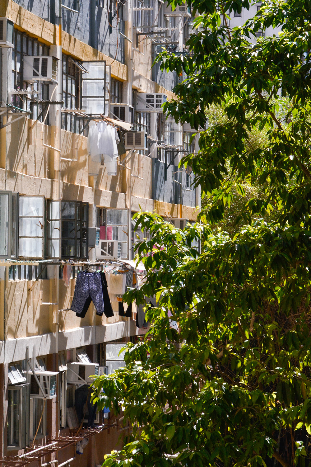
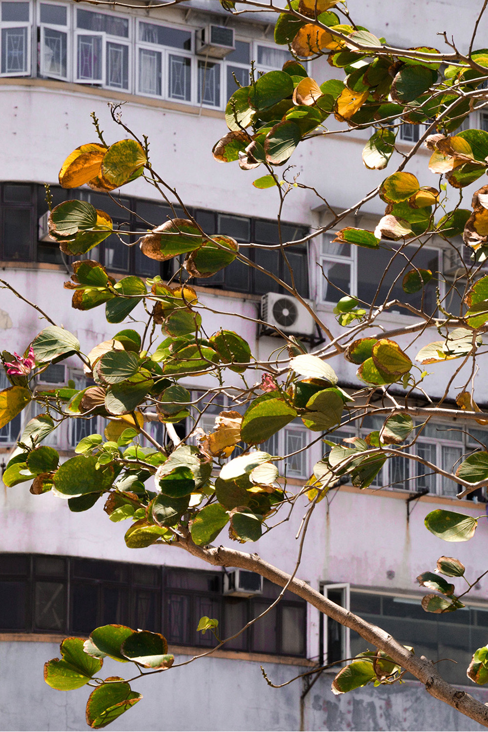
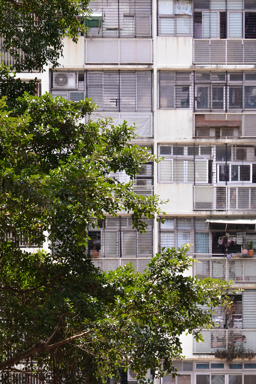
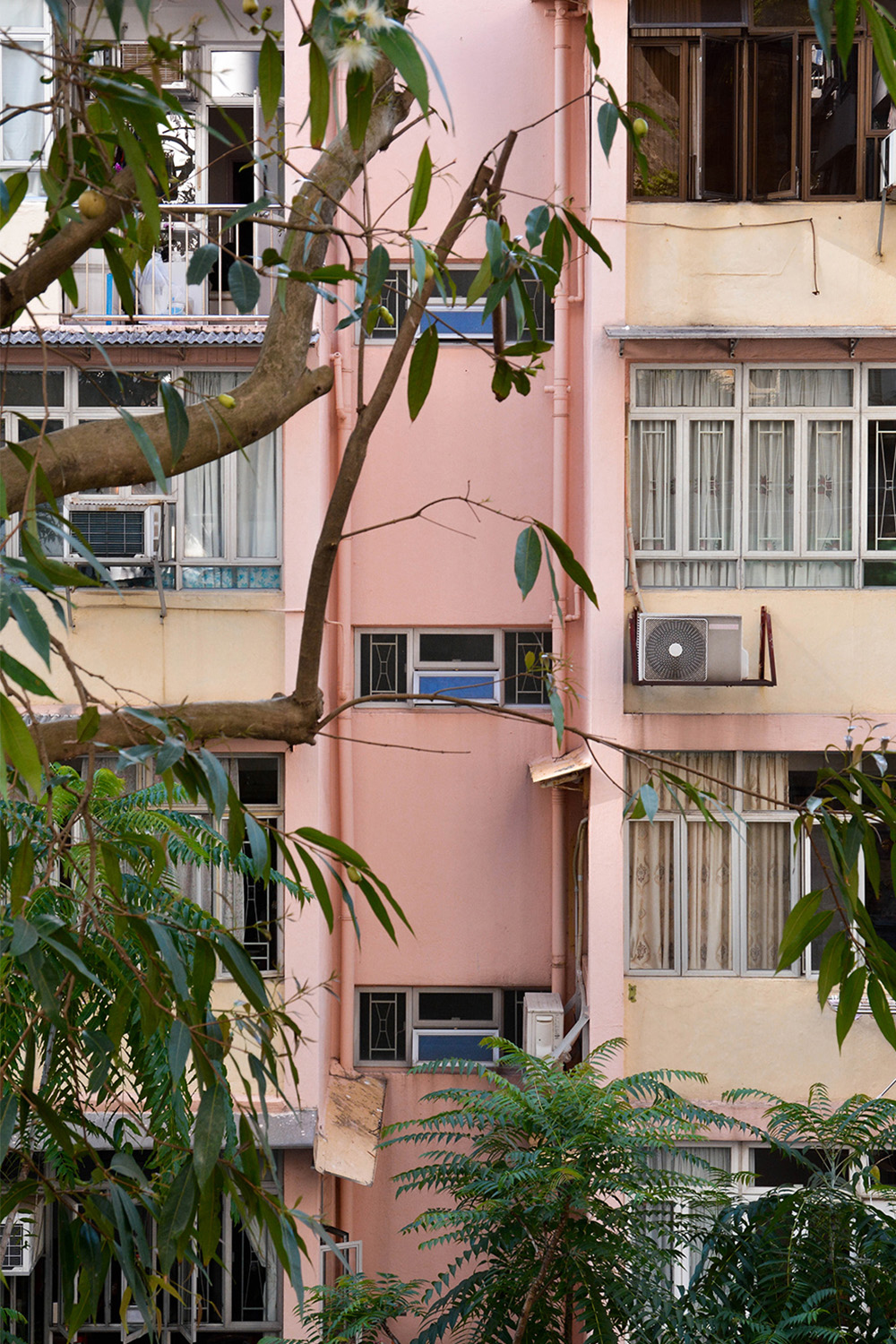
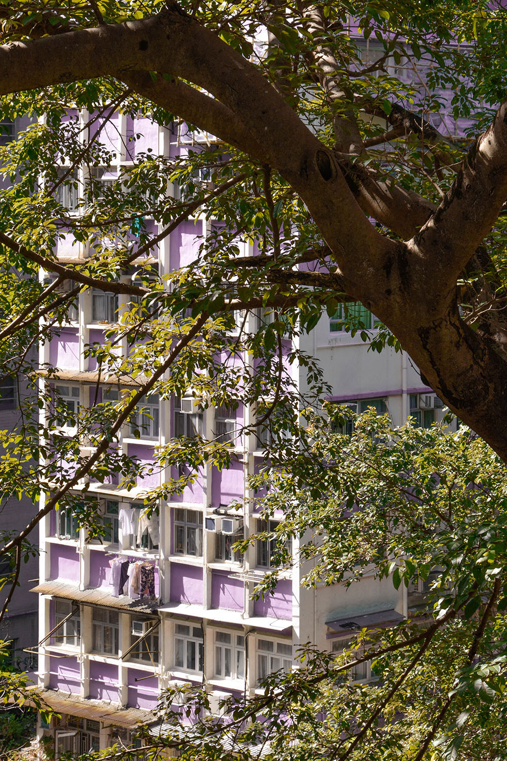
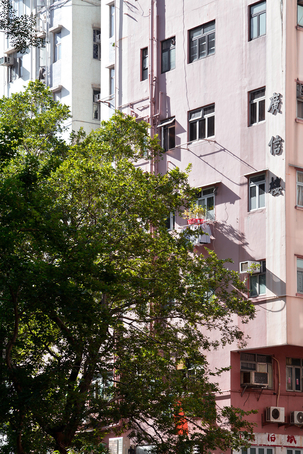
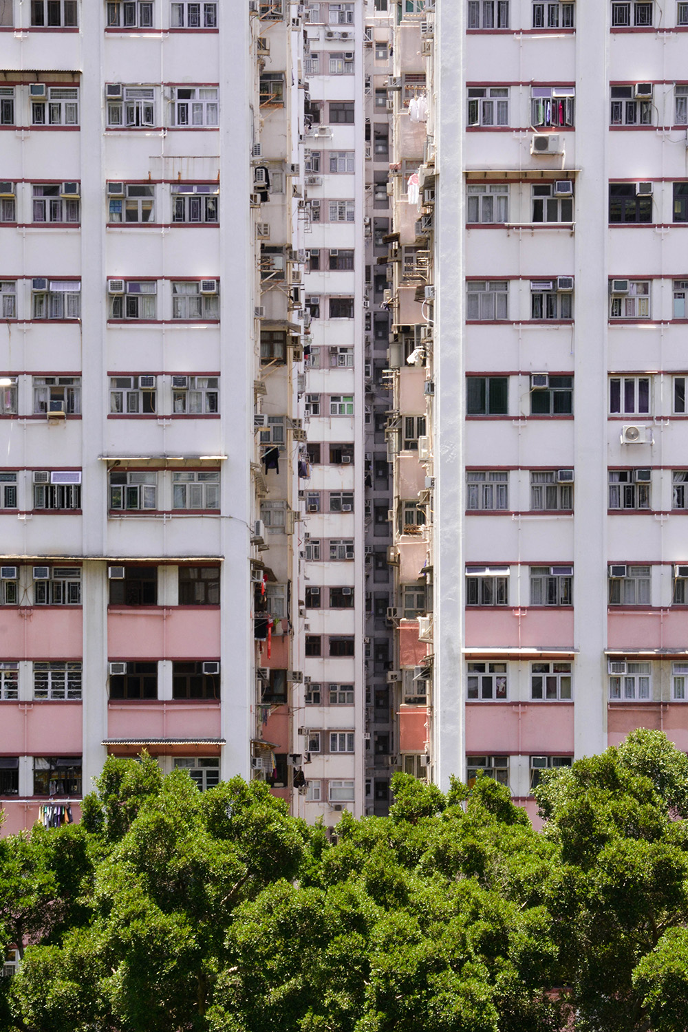
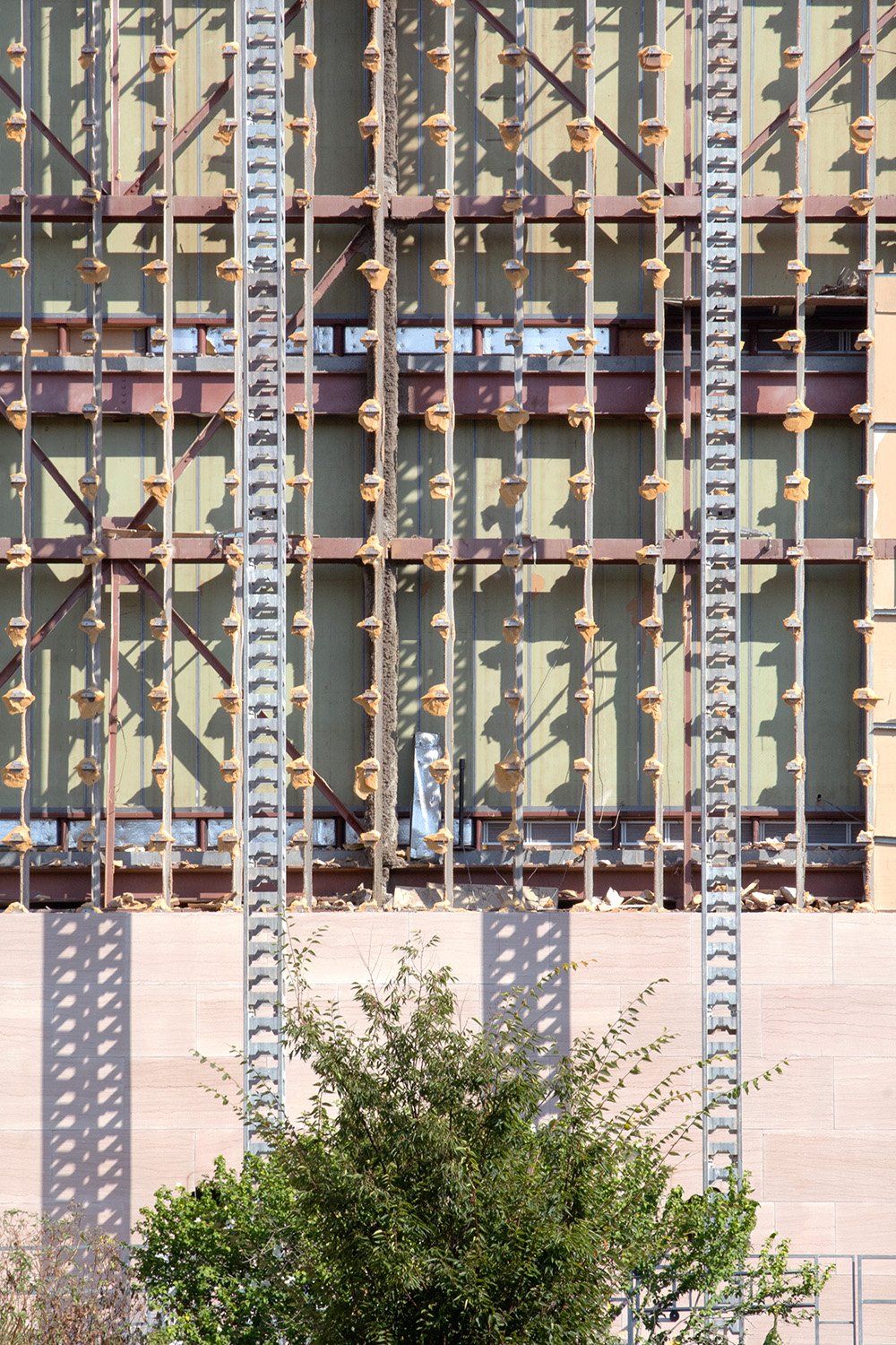
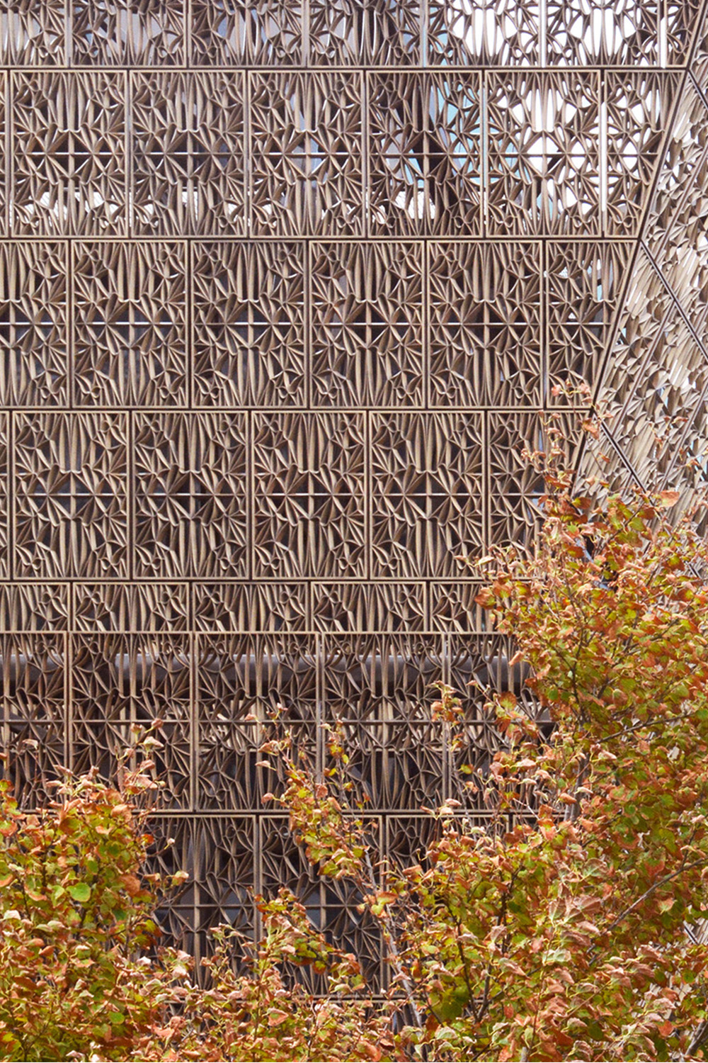
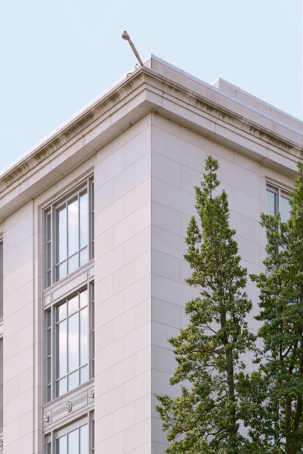
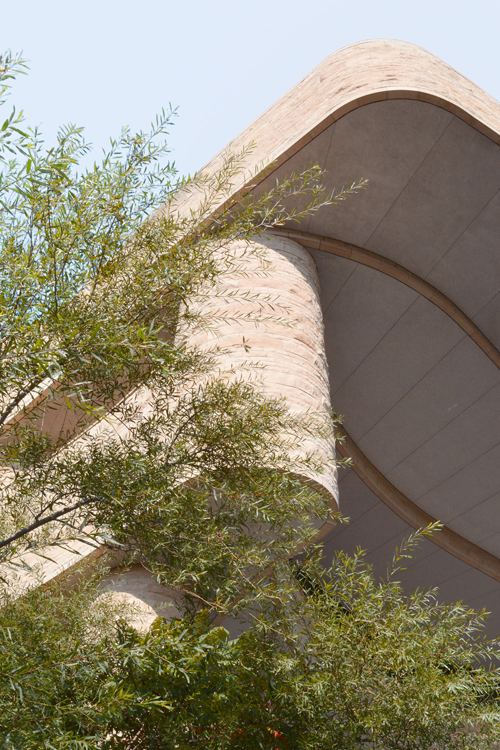
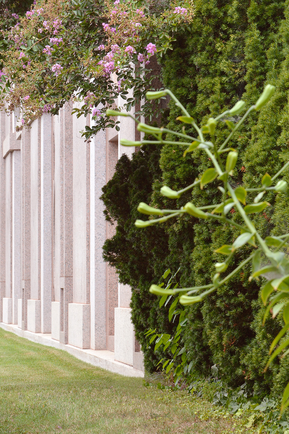
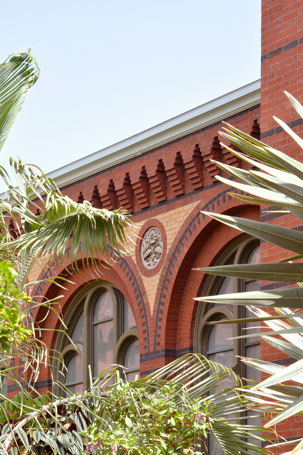
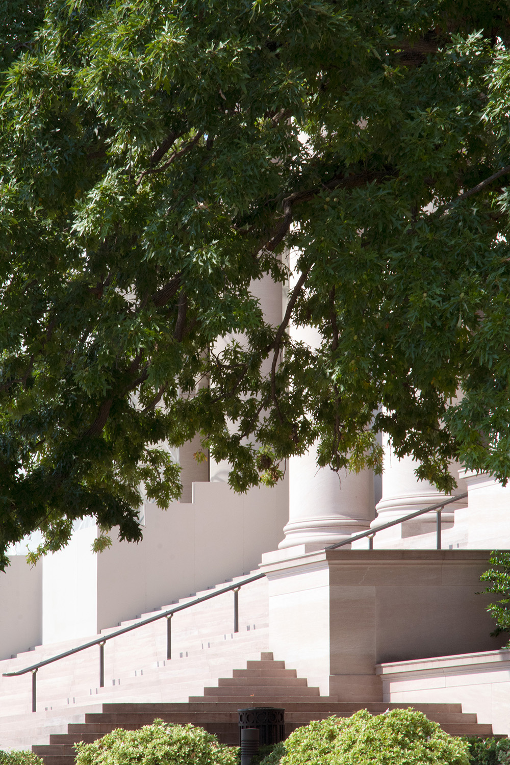
Trees as the background. Considered as a plant mass and reduced into a blur of green, the trees themselves are often obscured by bigger phenomena in the built environment; how much carbon can they sequester, do they provide enough habitat and how can they be inserted into interstitial spaces. Why not look at trees the same way we look at buildings? From the façade to the nuts and bolts. In great detail. Brought to the foreground.Architecture will be the background. Instead of star structures that stand out from the crowd, buildings with their geometric façade can be grid photo papers. In this series, the organic unruliness of trees interrupts the architectural correctness of buildings. By swapping landscape and architecture’s presumed roles as background and subject, the “first building, then surroundings” approach to city building can hopefully be challenged. This attempt is not about proposing a hierarchy in the built environment; but spotlighting a point-of-view that might encourage one to look at street trees differently.
HK
DC

KL
